YOSHIROTTEN is a graphic artist-cum-art director based out of Tokyo. With his graphic design and other works, he produces everything from spaces to movies to construct a unique worldview that anyone has never seen before. At the moment, he is a creator who is much sought-after from all sides, including fashion and music, as he gives shape to his expression in a variety of different ways.
Graphics that embody concepts what do not appear in the eye and other media, as well as collages, typography, and spatial design that all emit a powerful presence. While his designs take on all forms, we are focusing on typography at this time. We asked him about the connection with graphics and his thought process when he is working on a piece to explore whether there are any common denominators therein. We also posed the question of how YOSHIROTTEN intends to express himself going forward in a world altered by COVID-19. What is on his mind based on his read of the nature of the present moment? We also discuss the next vision for this graphic artist and art director who acts in the whole world.
I have a powerful sentiment of wanting to express
those things which are all the more invisible now
ーーPlease tell us about the graphics you give expression to.
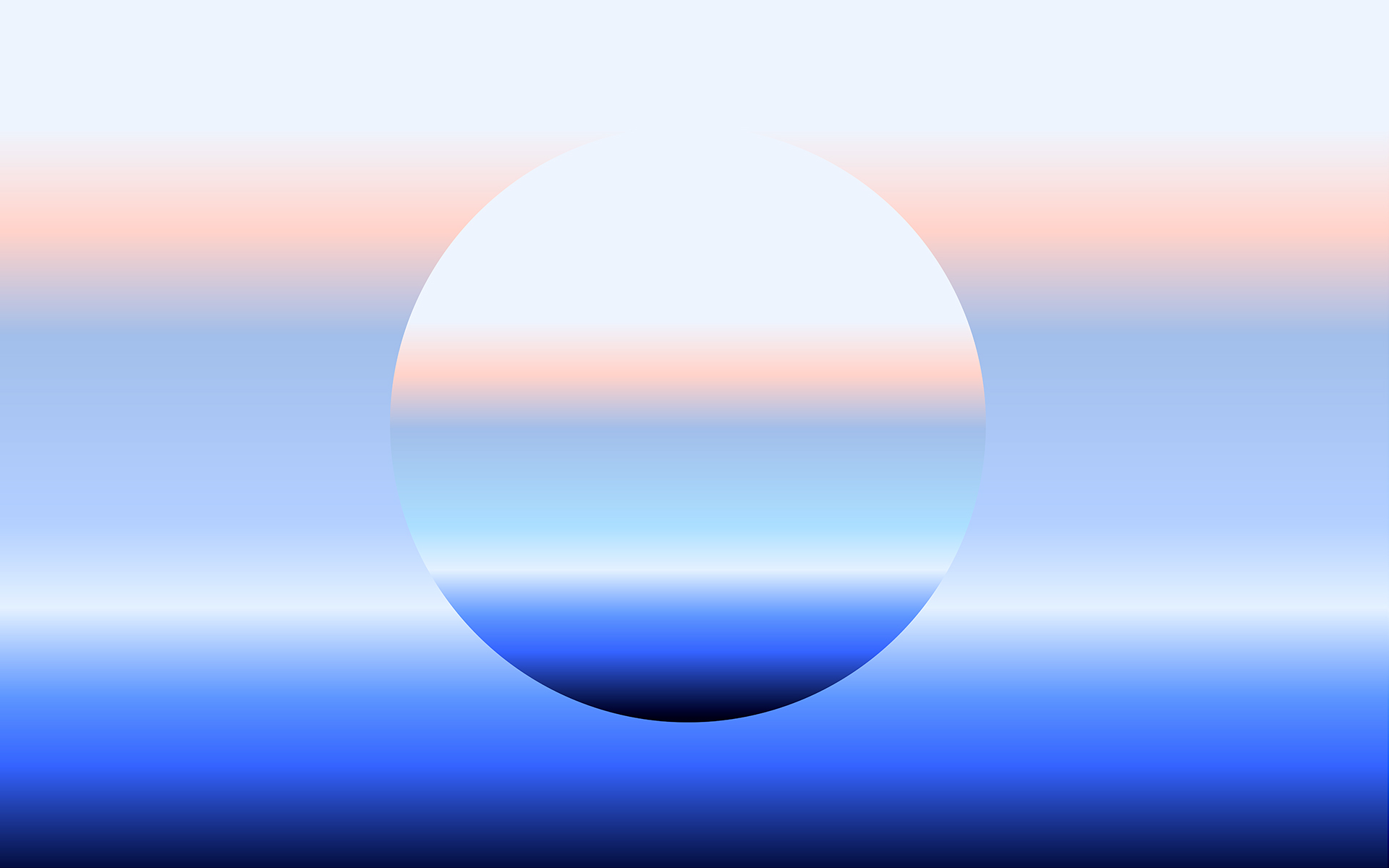
YOSHIROTTEN (YO): For my “FUTURE NATURE” exhibition held in 2018, the theme was “Visualizing the invisible,”, and now I have an even stronger desire to create works by that. I feel if the nature that has persisted all along overlaps with the future moving forward, visible things and what has come to our eyes through intermediary something is a mere fraction of how we perceive. When we shine a different light on them, the landscape appears to change further, and things that shouldn’t exist become visible. That activities such as imaging and depicting these sorts of things make up one dimension of my work as a graphic artist. At the same time, I flexibly create art direction and graphic designs for each purpose.
ーーAre there any aspects of your thinking inspired by a sense of the era?
YO: Yes, definitely. There are a lot of people in Japan who have started to work and act remotely due to COVID-19, but when people communicate over the internet, they aren’t actually in touch with one another, right? I believe there is a possibility that as technology evolves, that these sorts of virtual reality will increasingly become tinged with a sense of reality. For example, it may become possible to realistically project ocean or forest scenery over indoor windows, or even create and let people freely move these pseudo-spaces. I think when this becomes possible, we will come to perceive this as reality, even though what we’re perceiving with our eyes is not actually real. As this escalate, the scenes that are visible to us at this point may perhaps be nothing more than just holes in space. I enjoy giving shape to things by imagining them while thinking freely like that. My intent is to make the viewer recognize how we perceive the real and the virtual through my graphics and design. As the world continues to change in the future, I would be happy if I’m able to present to the world the ways in which art, technology, and nature have become closer in a manner suited to the era.
ーーI think collages are one of the characteristic styles of your works, which serve as a different approach from that of your graphics which express the invisible. What is your think about collages?
YO: This is a closely-held idea that lies at the foundation of my thinking, but I feel that collages are something new that are created through the collision of motifs with one another. Gathering together existing ideas gives form to new designs, and the ideas assembled therein convey messages and come to form designs that leave a powerful impression. I think that the interesting part of a collage is the place you arrive at by combining ideas together. I regard it as one way to further enhance and convey messages you would like to get across.
ーーNow then, what is your think about typography?
YO: Personally, I consider typography something you convert words and characters to shapes thereby instantaneously convey what they mean. There are various different types and methods, and the means of expression vary depending on the typography used to depict something. When creating a typography, although there are times when I customize and adjust an existing font to reach my desired destination, sometimes I make an entire alphabet from A through Z. The times when I’ve actually made a font are when I consent a request and find that there aren’t any suitable fonts. With logos and typography I’ve created to date, including for artworks and the like, a relative majority of these use original fonts. Of course, other designers also do quite frequently.
ーーSpecifically, in what sorts of cases do you create original fonts?
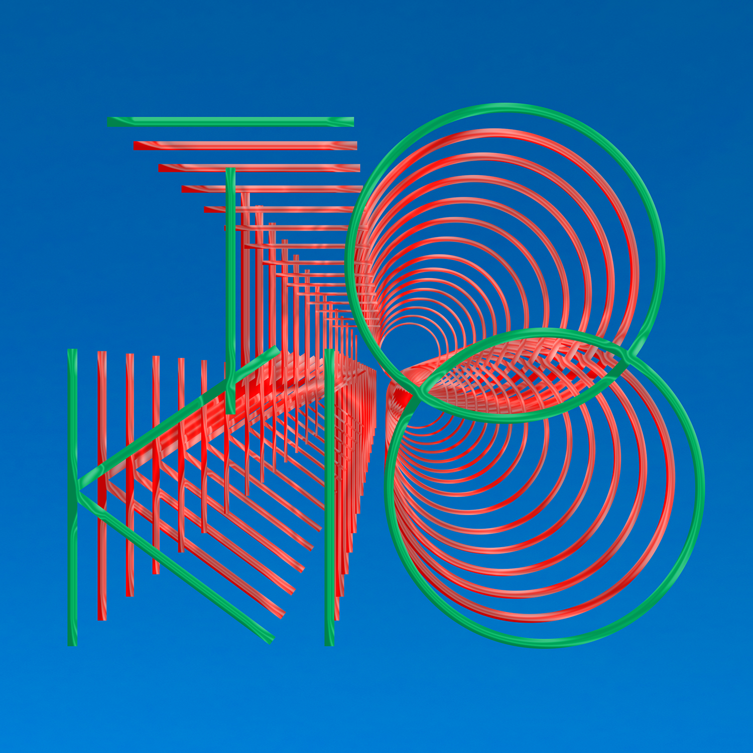
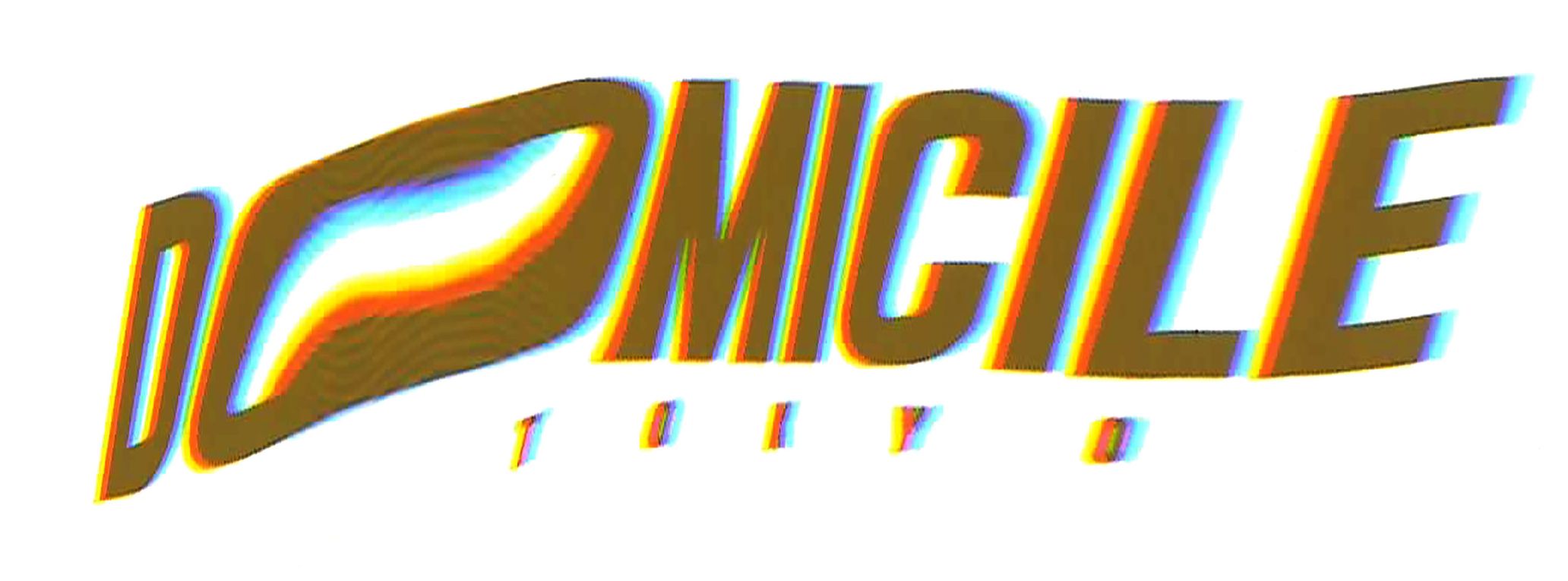
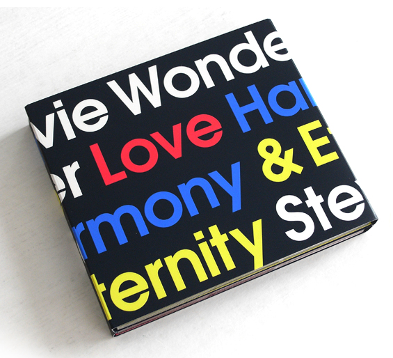
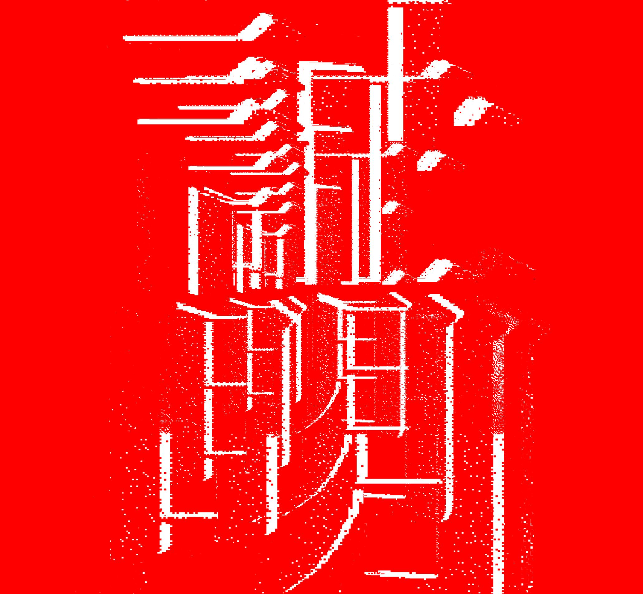
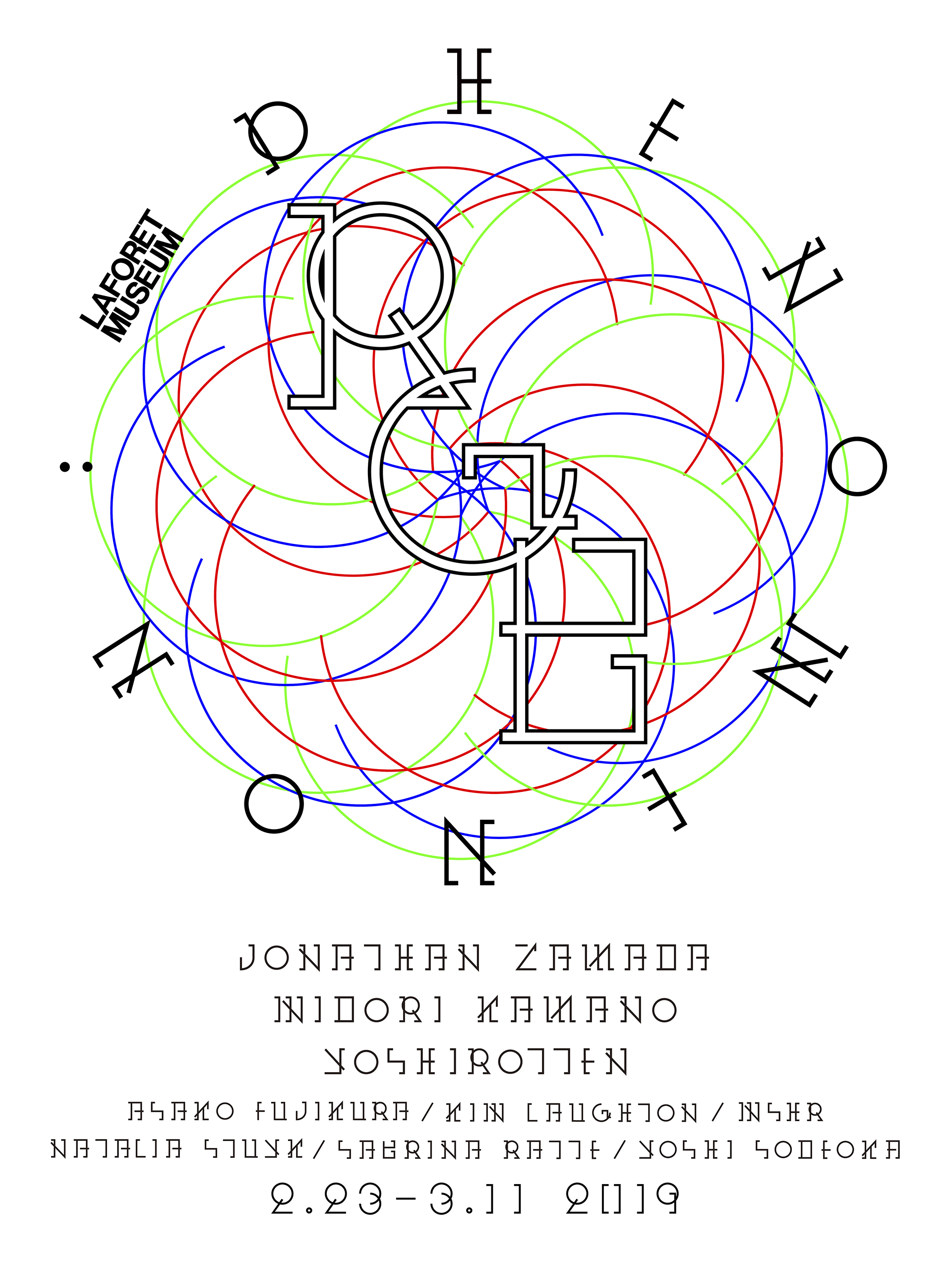
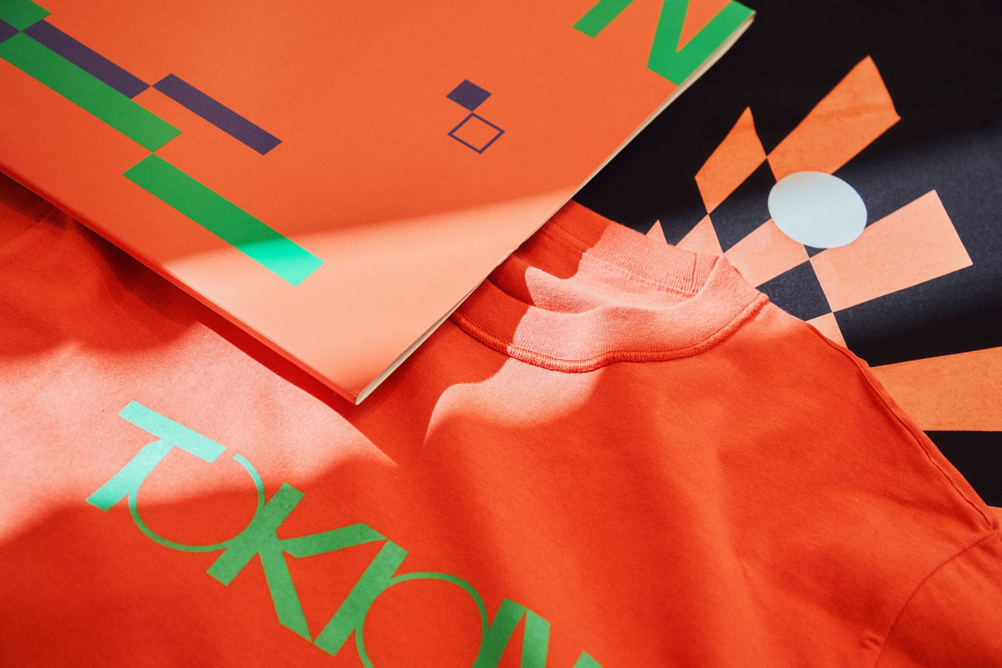
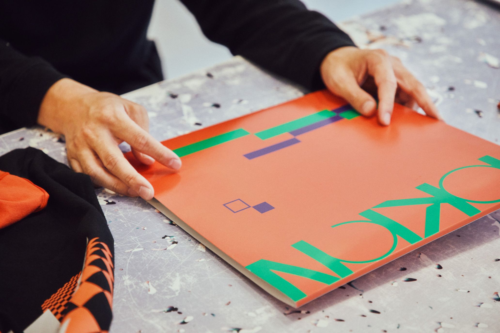
YO: In cases I need to strongly appeal the presence of a thing itself, like brand logos and shop logos. These require a typography with a presence imbued with an atmosphere and appearance that are totally unique to the thing itself. So, in many of these cases, I create an original font or customize an existing font. For example,When I created the typography of DOMICILE TOKYO in Harajuku, the old house renovated with near-futuristic art direction, I designed basic font and distorted it by using a copy machine to express street style of NEO TOKYO such as walking in the town while being drunk with alcohol and music. Conversely, when making the artwork for Stevie Wonder’s album “Love Harmony & Eternity”, I used a basic font that is commonly used all over the world without modification. This words themselves has a strong power, so I absolutely did not need any other visuals or superfluous elements aside from this. Therefore, I represented it with just coloring over the base font. On the other hand, the typography I created for GEZAN’s single “Shomei” (Proof) is expressed in a graphical manner where it is breaking out of its frame. This pattern violates the intended purpose of conveying words through characters, and strengthens the sense of presence by obscuring this. As a rule, those things that are rather incapable of explaining the patterns of techniques are typographical representations, and I find them fascinating for this reason. With the typography for “TOKIO” I made for UT, I imagined TOKYO floating in some future sky.
ーーHow do you personally feel about the connection between graphics and typography?
YO: Both of them have a close connection, with typography broadening the world of graphics, enhancing its sense of presence, and even shouldering responsibility for its explanatory elements. Simply put, I think there are some designs that can be realized by graphics alone, and some aspects where I think adding typography to them to provide explanation allows you to convey your message more powerfully.
ーーDo you ever have any difficulties in creating original fonts?
YO: When I make an original font, I create everything from A to Z, even if they won’t be used. I think you ought to have consistent rules for this. Therefore, the question of how you go about establishing these rules may present a difficulty.
ーーAre there any artists who have influenced you in terms of how you express your typography?
YO: When it comes to the very first artist to move me deeply, that would have to be the fonts of Herb Lubalin. He did the culture magazine called “Avant Garde,” and I was shocked when I saw the way he was using typography in the pages of that magazine. It had this rather free, powerful, avant-garde design for its lettering as I recall. It left a profound impression on me and led me to begin creating my own characters. I’m also a fan of the way Jamie Reid and April Greiman combined typography with artwork. Other artists I like for their use of fonts would include Lawrence Weiner and Christopher Wool.
The real thrill of spatial design
lies in having experiences that stay with you
ーーAt the same time, at present you frequently undertake the design for spaces like the interiors of shops, correct?
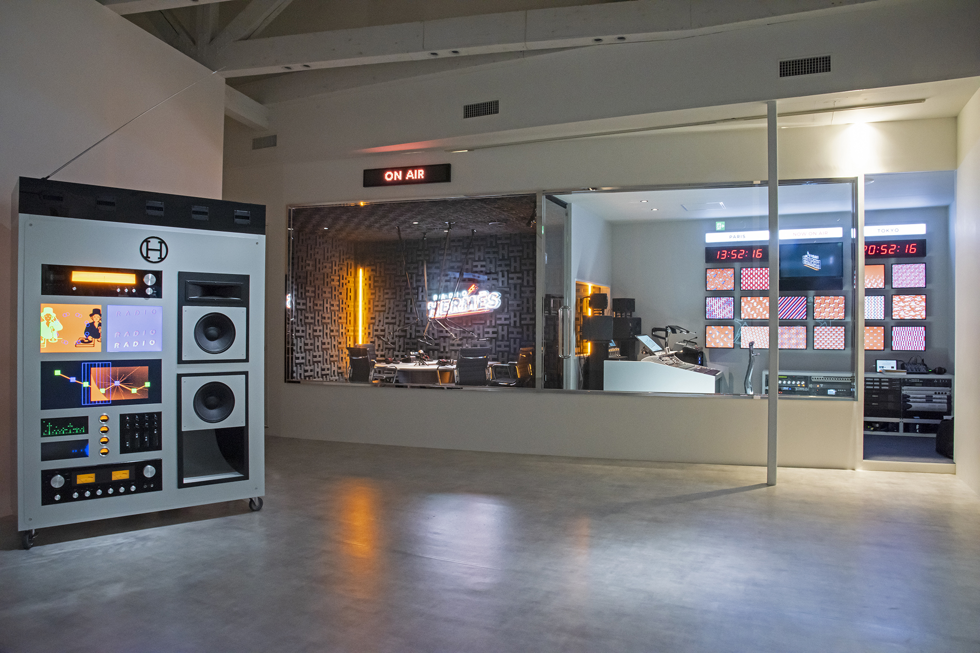
YO: That’s right. I produce the spaces for shops and pop-ups, and increasingly I’m creating them in an all-encompassing manner that includes designing the items found within them and images projected there as well. I think that the real thrill when it comes to designing spaces lies in “being able to experience them.” The experience of being able to enter a space created by someone. This is different from a design on a flat plane. Three-dimensional spaces come about as a combination of the sounds, scents, visitors, and various other elements, and I feel that an important aspect when it comes to designing them lies in this fact. Recently, I’ve been working more and more on designs that are represented in 3D and then later recreate 2D version. Perhaps most of my client work is fashion and music. What can I do to make a product more highly visible? Nowadays, when data comes in and instantaneously flows through our smartphones, what can I do to capture people’s gaze, or to make them think that something is pleasant or wonderful? Conversely, can I make something that will give them a shock? While considering these questions, I go about creating designs by altering the technique and expression itself to suit the purpose.
ーーI see. By the way, can you tell us about the products you recently created through your collaboration with TOKION?
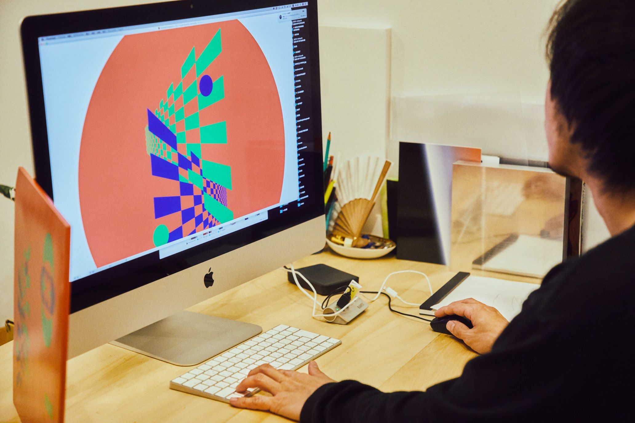
YO: I personally came up with these designs out of a desire to create items similar to typical Japanese souvenirs. Therefore, since I love soba, this gave me the idea to have a go at making a soba serving bowl and small dish adorned with graphics. I thought it would be interesting to incorporate a near-futuristic approach in an exquisitely balanced manner by representing traditional Japanese images on a base of vermilion, which is a traditional Japanese color. The graphic consists of an image that is like a new version of Japanese checkered pattern. This would normally be a flat, planar pattern, but I think that representing this with a sense of depth makes it seem futuristic. The typography for “TOKION” was created through a worldview that encourages you to stand right here and grow accustomed to it.
ーーWhat sorts of things would you like to create in the future?
YO: While this is an extension of what I said about designing spaces, I would like to give creating a park a try.
ーーWhy would you also like to do a park?
YO: Perhaps if children were to play in a public space that I worked on the experience may remain itself in their memory, even if just a little. Then, as they grew up into adults, perhaps it would broaden the powers of imagination of those kids. I feel a desire to act in such a way that my creations can be entrusted to future generations in some manner. I would also enjoy it if my park were to be the spark that helped revitalize a neighborhood. Plus, more than anything I think it would be great if fun-looking playground equipment exist in public facilities, right? I recently went to a place where I used to play long ago, and saw it in its current condition, where somehow really deserted and there was nobody there. I felt a twinge of sadness at that. I think it would be a lot of fun to update this place in a manner more suited to the modern age, and feel like this would be something that I could do.
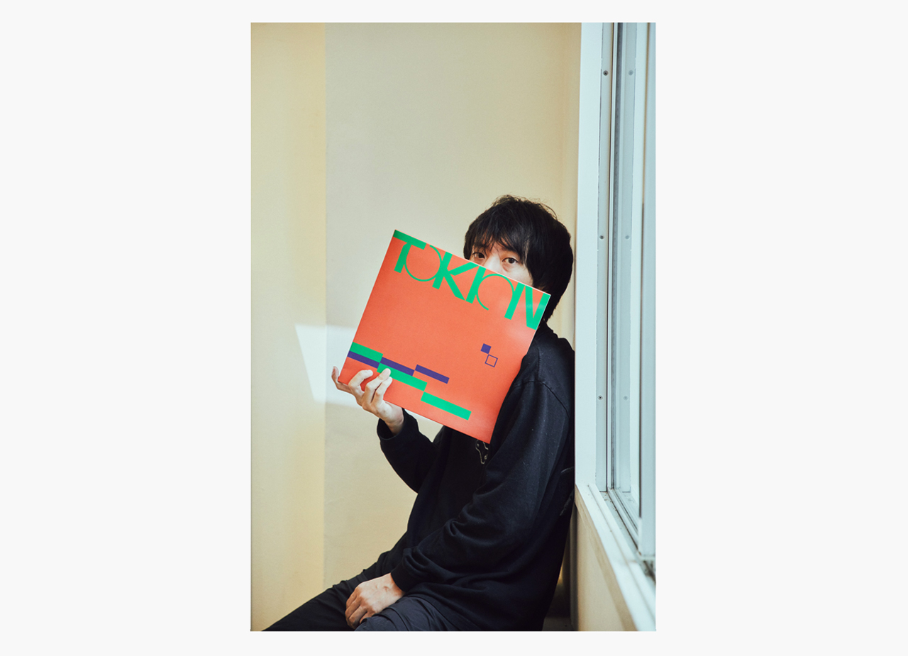
Graphic artist and art director. Representative of Creative Studio YAR. A creator who does not just do graphic work, but is representative of the next generation who provide creative direction under a single unified worldview for everything from spaces to images.
http://www.yoshirotten.com/
Photography Tetsuya Yamakawa
Text Ryo Tajima
