“To put it simply, I owe it to Adobe and Apple.”
That’s what Tsuyoshi Kusano, the art director behind numerous popular anime series, says about his work as a graphic designer. Kusano, who has been interested in video game packaging design and brand logos since he was young, says that the process of graphic design feels similar to video games.
“The experience of operating graphic tools is an extension of video games [UI & UX], and in a way, the feeling and process of putting ideas together and giving them shape might be similar to playing with digital crafting tools like Minecraft.”
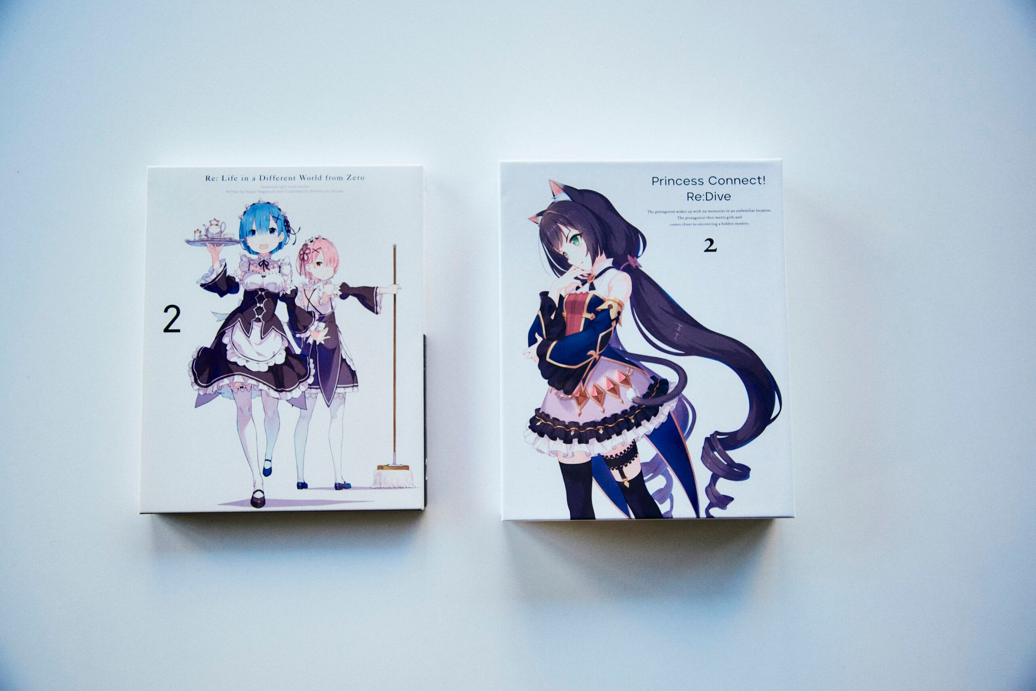
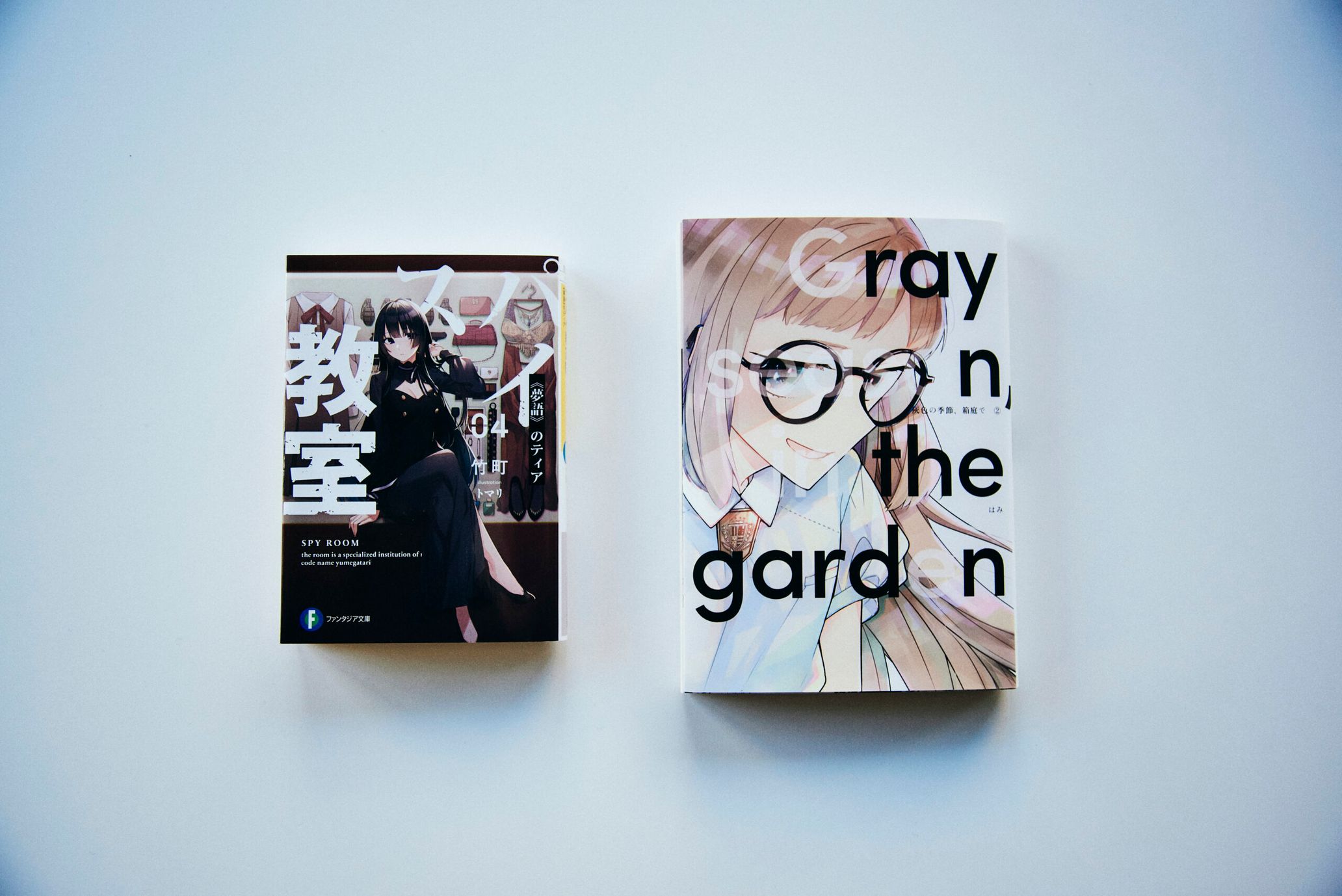
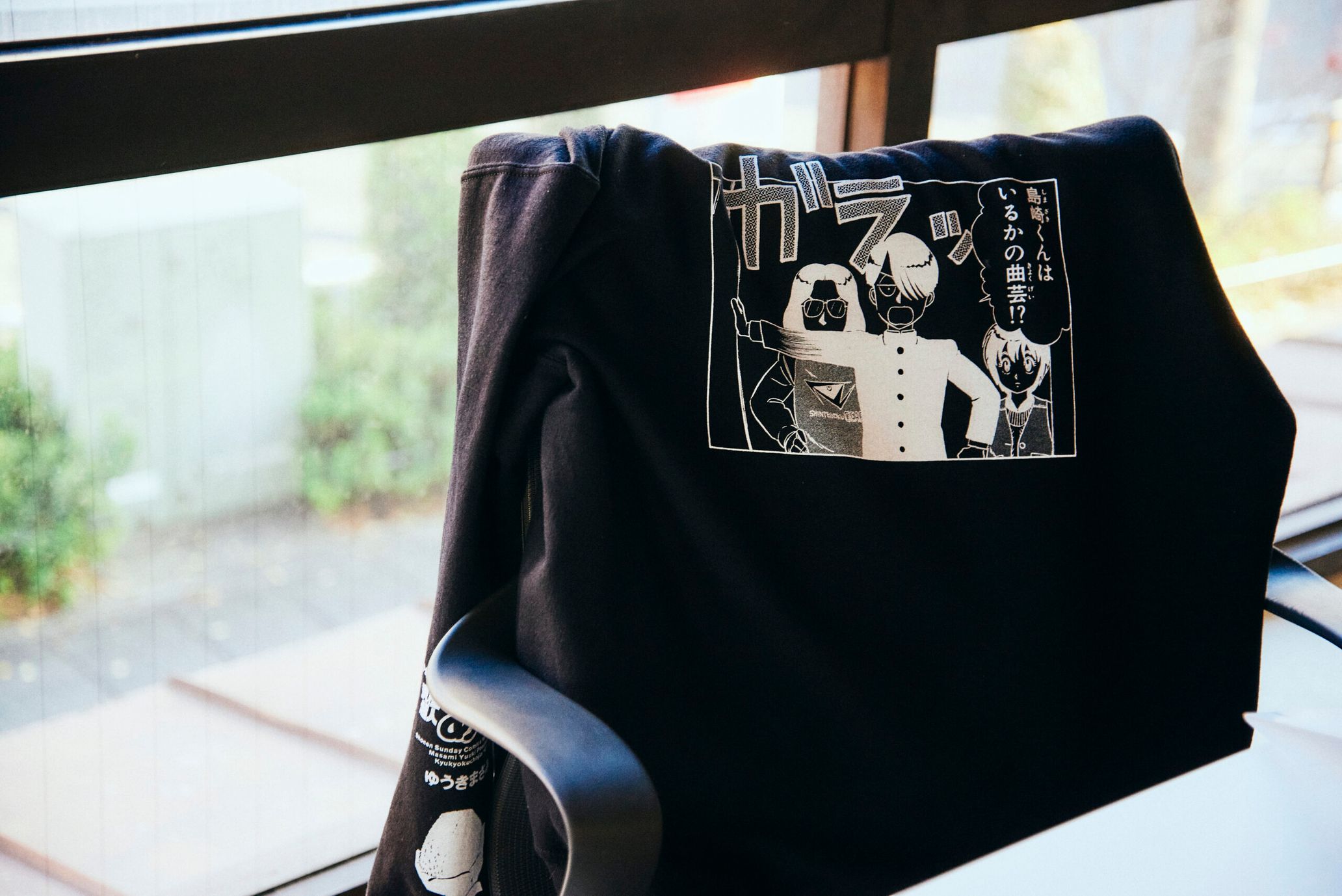
Most of Kusano’s anime-related graphic design work is simple, clean, and created with minimal elements. Influenced by anime and video games, he worked in graphic design in many fields including advertising, apparel, and editorial from the late 1990s to the early 2000s. So what made him choose anime as his battlefield after the 2000s? And what are the distinguishing characteristics of graphic design for anime? I caught up with Kusano at the Kusano Design Office.
I chose to make anime my battlefield
——After starting your own business as a graphic designer, you were designing ads, logos, apparel, and packaging in a wide variety of areas, from counterculture to mass media. So, why did you shift to work that mainly focuses on anime, as you’re currently doing?
Tsuyoshi Kusano: Basically, I’ve led my career while going with the flow, but anime is the result of an active choice. At the time, I’d become independent from the publisher I’d been working for, Enterbrain, and I set up an office in Sangenjaya, which was the nearest station. Dai [Screenwriter Dai Sato] would sometimes drop by the office late at night. It was right around the time that Dai was working on the script for “Cowboy Bebop.” At the time, I was really inspired by “[Cowboy] Bebop,” so I asked him if it would be possible to get involved in the animation.
——The same Dai who would later go on to work on “Eureka Seven,” right?
Kusano: Right. After that, Dai introduced me to Minami [Masahiko] of Bones, and I got to enter a competition to design the motion logo for Bones used in the movie version of “Cowboy Bebop,” and luckily, I was selected. This was the start of my shift towards anime-related work.
—— So they really appreciated your work on “Cowboy Bebop.”
Kusano: No, I don’t think that was the case. Because after that, I didn’t get any work requests for a while, so I was living my life as I had before—taking work in advertising, music, and fashion. (laughs) Then, about a year or two after “Cowboy Bebop,” Minami reached out to about whether I’d be interested in developing merchandise for a show called “Wolf’s Rain.” He asked me, “You used to [work] in fashion, right?” But instead, I replied, “Could I do something related to the work itself instead of the merchandise?” And then, Minami told me, “I’ll include you in a presentation—could you prepare your portfolio?” In the end, it was decided that I’d work on “Full Metal Alchemist.”
——I see. Exactly what kind of work were you responsible for on “Full Metal Alchemist?”
Kusano: I started out with logo design. I was suddenly allowed to participate in meetings with all the key staff members, including the director and producer, so looking back on that now, I feel really grateful. I was also responsible for the DVD packaging and advertising. And from there, I started to expand my horizons to other areas like books, toys, figurines, plastic models, and apparel. So while “Cowboy Bebop” was the beginning of my anime career, I think “Fullmetal Alchemist” was a gateway to my current work. I received a lot of work requests from clients who’d seen that work, and more importantly, it was also the starting point to developing a relationship with Oyama [Producer Ryo Oyama].
——I think many people remember “Eureka Seven” as representative of your work.
Kusano: I worked on “Eureka Seven” with Ryo, Director [Tomoki] Kyoda, and [Kenichi] Yoshida. The vision and understanding of design that these three had made it possible to take on the branding and various challenges.

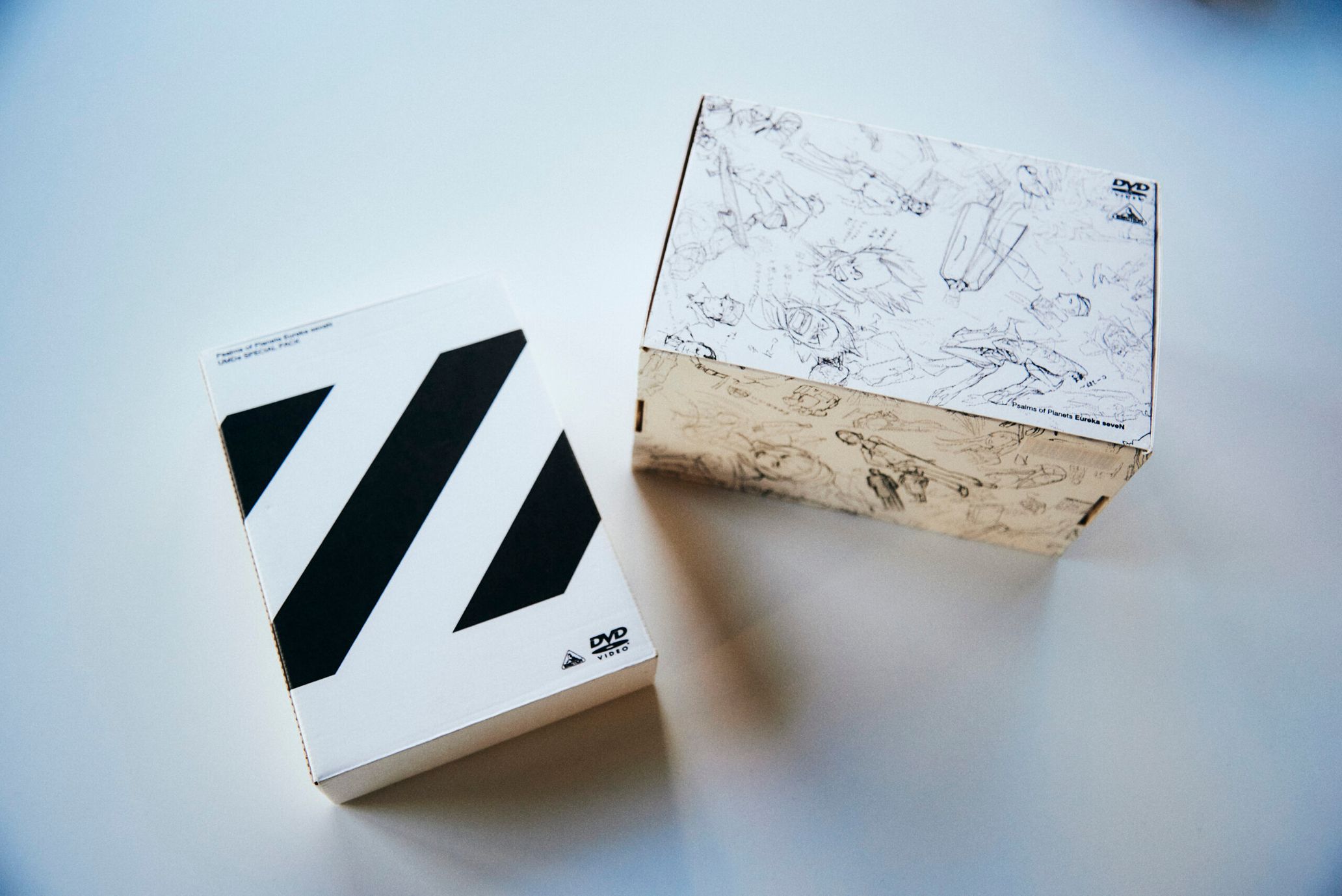
——In “Eureka Seven,“ I was impressed that the eyecatch that connects part A and B of a story included design too.
Kusano: I started to be more particular about the anime itself as well starting with this work. I’m not completely certain, but I have a memory of proposing to Director Kyoda, “Please let me handle the eyecatch,” and him letting me.
——From what I’ve read in your past interviews, you said you were feeling burnt out after finishing your work on “Eureka Seven.”
Kusano: “Eureka Seven” was created around the time when media was transitioning onto the web. In addition to developing a wide range of manga, light novels, ads, and music, the main anime was a massive four-season production. I think it would be very difficult to develop a work of that scale nowadays. It was a tremendous experience. So I figured, “After this, I can’t act like an amateur [regarding graphic design for anime].”
I want to change the environment of anime through design
——When you work on anime-related graphic design, what are some of the things you pay attention to?
Kusano: I think a major underlying theme of my work is the idea of updating and breaking away from children’s culture. Around the time that I was in middle school, the word “otaku” became more widely recognized as a result of the Tsutomu Miyazaki [a serial killer known as the “Otaku Murderer”] incident, and due to that, I felt really suffocated. From then, I started to think, “I want to do away with anime’s bad reputation. I want to tell people that it’s a form of expression they can enjoy as deeply as film, music, or literature.” I’m not just talking about myself. There are a lot of stories like, “I pursued science after watching ‘Astro Boy’” or “I became a soccer player because of ‘Captain Tsubasa’,” right? And there are stories like that not only in Japan but all over the world. So when you think about it, manga and anime must have a surprisingly large influence on people. Personally, much of my internal sense of justice was instilled in me by manga and anime, so those things actually can have a greater influence than parents or teachers.
However, anime is also a field where fetishism strongly stands out, and I think that’s what makes it look so juvenile compared to other forms of expression. For example, there are a lot of works that go too far or stories that only feature girls. Maybe it’d be accurate to see that as a self-serving, anti-social attitude. Be that as it may, there certainly are parts of every field, even outside of anime, that are fueled by capitalistic, wasteful consumption, neatly concealed from view. So in that sense, I guess you could say that even before its expression, anime’s method of appealing to consumers is upfront and juvenile.
——I see.
Kusano: When I think about the theme of updating and breaking away from children’s culture, I think in particular, [Yoshiyuki] Tomino of “Mobile Suit Gundam” is someone who advanced this idea. If anime focuses on children as the target for its products, market forces will favor ease of understanding. While of course, there are earlier examples like “Space Battleship Yamato” and “Lupin the Third,” Gundam’s production holds up for adult viewers, too. The same is true for design, which has to guide people so even younger viewers can understand. And as for the Showa era, when the concept of “diversity” wasn’t recognized, there wasn’t anything that deviated from the norms of that field, so the expression became more standardized.
——It’s true that before “Gundam,” there was a uniform image that one could call “Showa anime.”
Kusano: Tomino broke through that standardization with proposals for titles like “Soldiers of Sorrow” and “Encounters in Space” and key visuals drawn by Yoshikazu Yasuhiko. In turn, the packaging design began to change, and they started selling related books and records rather than just Gundam models and such. So the audience became not only children, but also high schoolers, college students, and new working adults, making the work itself a huge hit.
——My impression of your graphic design work for anime is that you basically create a simple layout that makes the illustration stand out, while adding a fetishistic feel to the typography of the logo and such. Does this simplicity come from the idea of updating and breaking away from children’s culture?
Kusano: That’s right. I think if you want to reach as many people as possible, your work will give off that impression. For example, MUJI and Uniqlo have created an accessible image. Regarding the branding, the logo is an element that affects the brand impression. Rather than choosing one-of-a-kind lettering, they chose an existing font and adjusted it to give it a look that says, “This belongs to everyone and no one.” That being said, it’s not enough to create something universal. It’s necessary to figure out the main information, pay attention to the density of the layout and the presence of counters, all while polishing it off with a high level of precision.

——I especially sense that you’re quite particular about typography in your designs.
Kusano: Due to the aforementioned reason, I don’t create high-context designs with decoration according to the work. Rather, I take a simple approach. So then, the design elements are limited to visual information as pictures and verbal information as text. Also, I’m not the one drawing the pictures. So the role of “decoration” naturally falls on the typeface. I think I decorate and create an impression through the text’s position, size, typeface appearance, kerning, and leading.
——Thank you. Now I understand why your designs give me the impression that they do.
Kusano: I create simple designs because I want to reach as many people as possible, but also because I want to create a mood and worldview that allows fans to interact with the work for as long as possible. After the late-night anime boom, the cycle of anime became one season every three months. So it became an environment where no one was talking about that work anymore by the following year. I don’t think I can resist that sweeping trend, but I’d like to create an atmosphere (space) with my designs so fans can mindfully interact with the work for 5 years if possible, or 10 years even. If you incorporate the characteristics of a specific genre or time period, there’s the concern that the work will quickly become irrelevant, so you start to think that flashy behavior in design isn’t appropriate.
But recently, there’s been more content like Fortnite that’s continually updated. So I’m starting to think that aside from the physical package, it might be nice if designs weren’t limited by simplicity and could be changed every time.
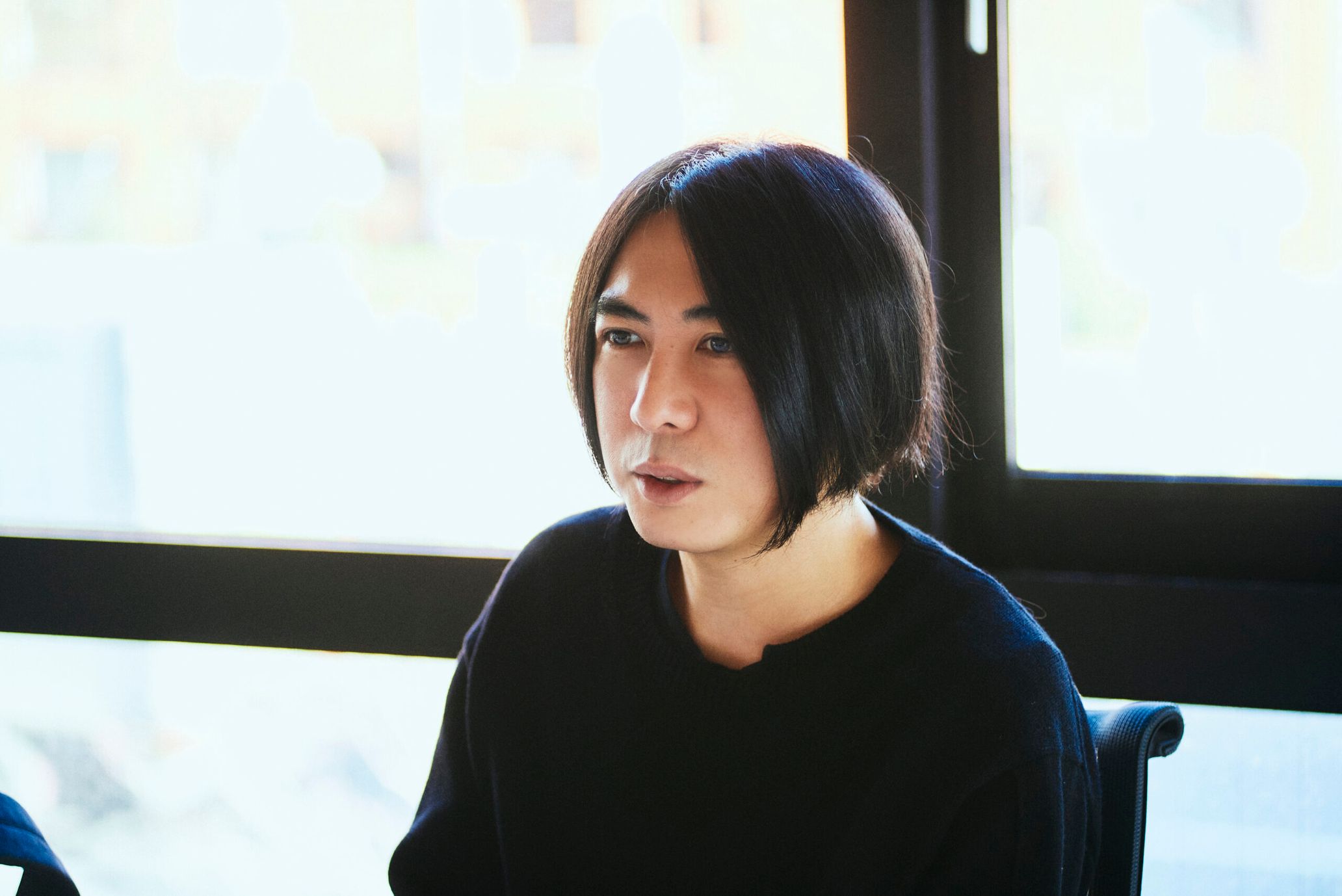
Tsuyoshi Kusano
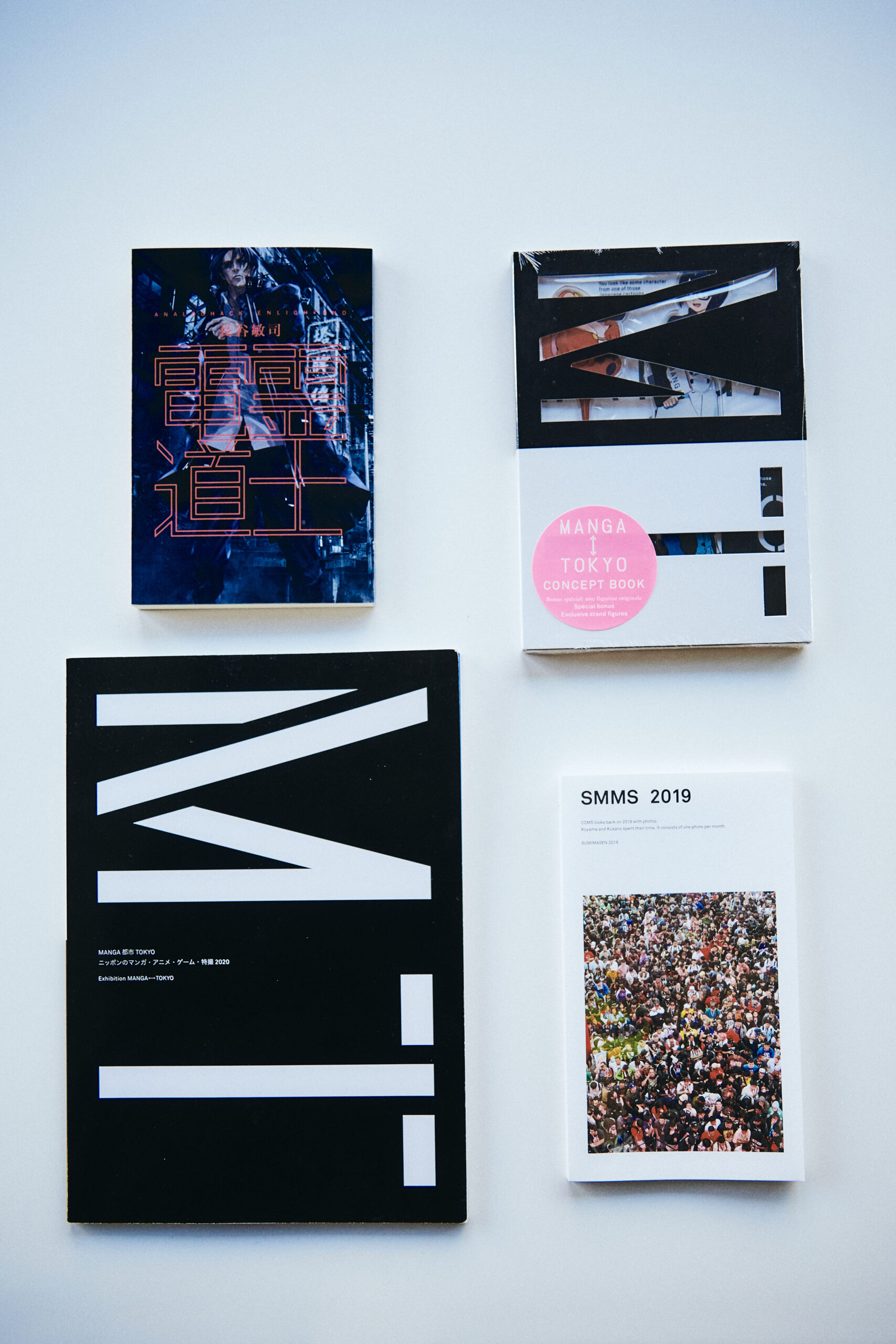
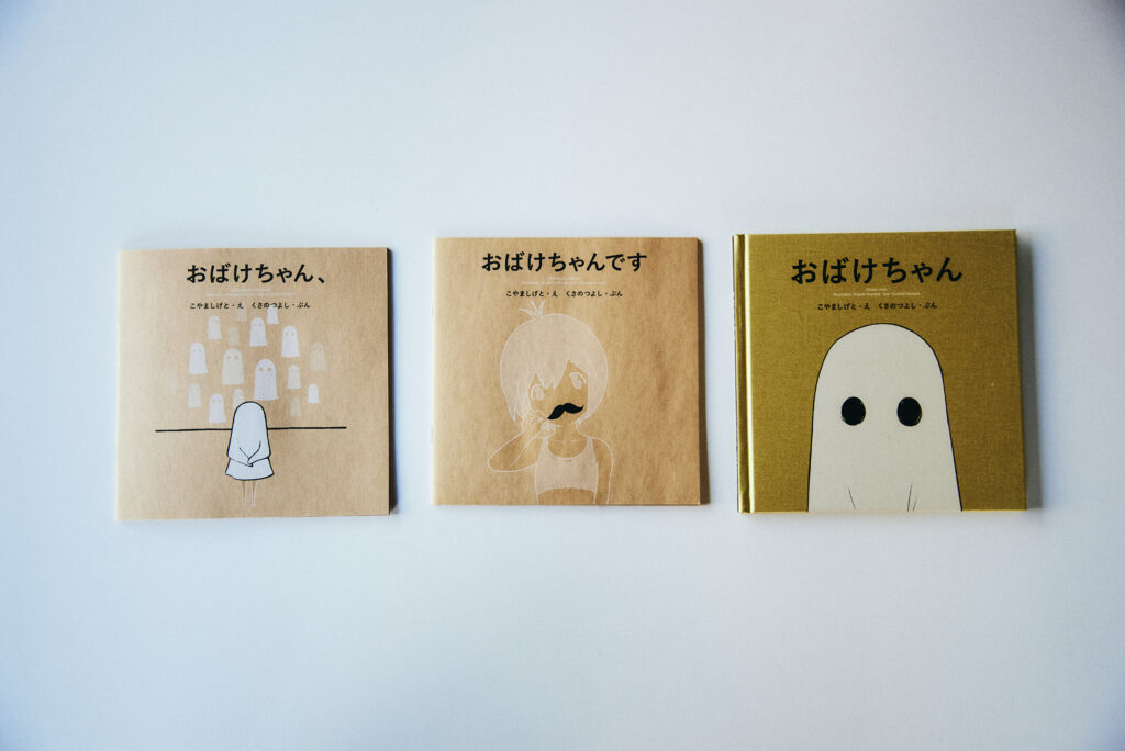
Born in Tokyo in 1973, Tsuyoshi Kusano is an art director and graphic designer who produces graphic design of all kinds. After working for ASCII, he established the Tsuyoshi Kusano Design Office. He is also a part-time lecturer at Musashino Art University’s Department of Design Informatics, as well as a lecturer at Chuo University’s Faculty of Global Informatics. Additionally, he runs the doujin circle CCMS with Shigeto Koyama. Since 2015, he has served as a trustee of the creators’ association, JMAG.
http://www.kusano-design.com
Photopgraphy Hironori Sakunaga
Translation Aya Apton